Higher Brain Monitor: A Physical UX for the Home AI Lab
Summary: Sometimes it takes a wall of blinking lights to realize your machines have been trying to talk to you all along. The Higher Brain Monitor is a small, human first, experiment in ambient physical observability: six Nanoleaf panels that give a local AI lab clear body language so you can tell - at a glance and from across the room - when the system is idle, thinking, reading text from images or processing web data, listening and or speaking, watching, or asking for help when I give it too much too handle.
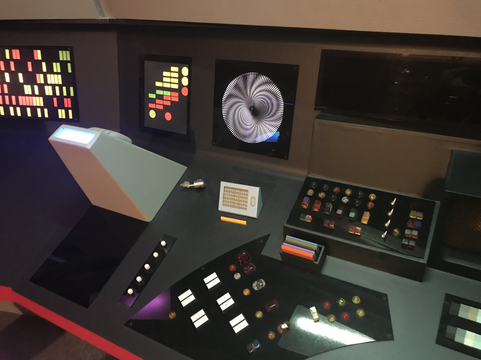
To be honest, this inspired by the bridge console of Star Trek TOS, the project leans into theatrical, human-readable signals - pulses, breaths, flickers - so the room can say “the lab is thinking” instead of “CPU is above threshold.” It’s not a replacement for dashboards or alerts; it’s a different kind of UX that makes system state legible without pulling you into an incident, and it carries the quieter, human-side question of why we build what we build right now.
Note: This project is a quiet, personal nod to my mother, who kept dreams alive for me as a child - reminding me that the best futures are the kind that make people feel seen, included, safe to explore and never alone.
Higher Brain Monitor: A Physical UX for the Home AI Lab
Making the invisible work of local AI visible in the room
Overview
Web dashboards, aggregated logs, and Slack alerts are great - but there’s a case for body language for these platforms, if you will bear with me. It’s the reason sailors gave ocean vessels endearing names, after all.
"Resonance Lab," my self study Contoso project as I work toward my own AI architecture path, began as a string of practical use cases; STT, TTS, a local LLM, RAG, a gateway which and quietly accreted into an ecology. One box became many: lab-stt, a 20 core NUC, grew into, then out of, the brain stem, a System76 Pangolin became the operator console, an NVIDIA Jetson the eyes, and a small nebula of services took on the unglamorous work of listening, indexing, routing, and speaking. Each process has a job, logs, and an arguably special way of ruining a peaceful cup of coffee. Most of that commotion, however, is invisible from across the room.
I already had monitoring: unified dashboards, health checks, alerts, and scripts that tell me when something is wrong. Those tools are necessary, but they demand attention. They yank you out of whatever you’re doing and into an incident. I wanted something different - a way for the lab to communicate without an invitation. I wanted the body language of a ship, so to speak.
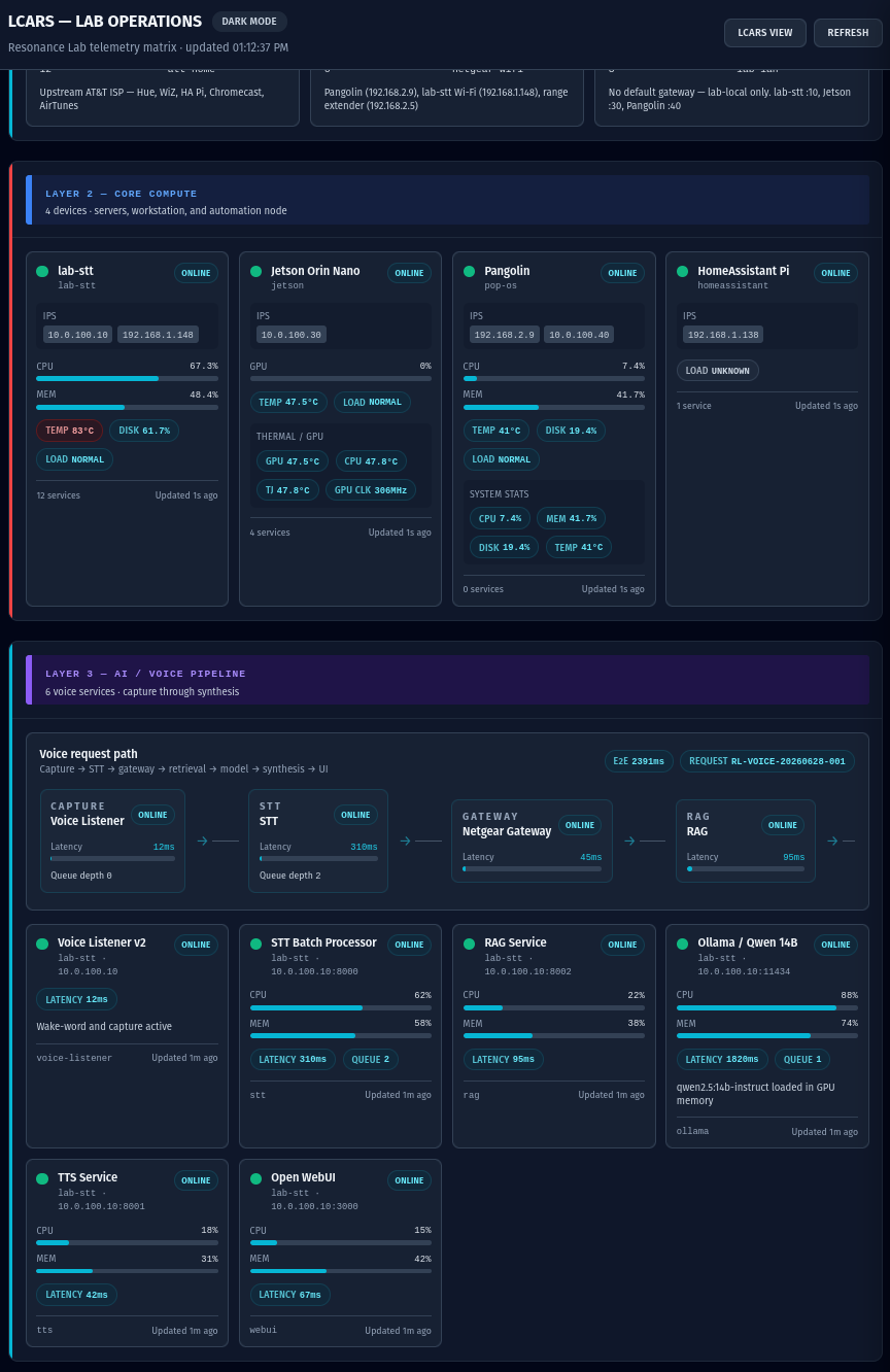
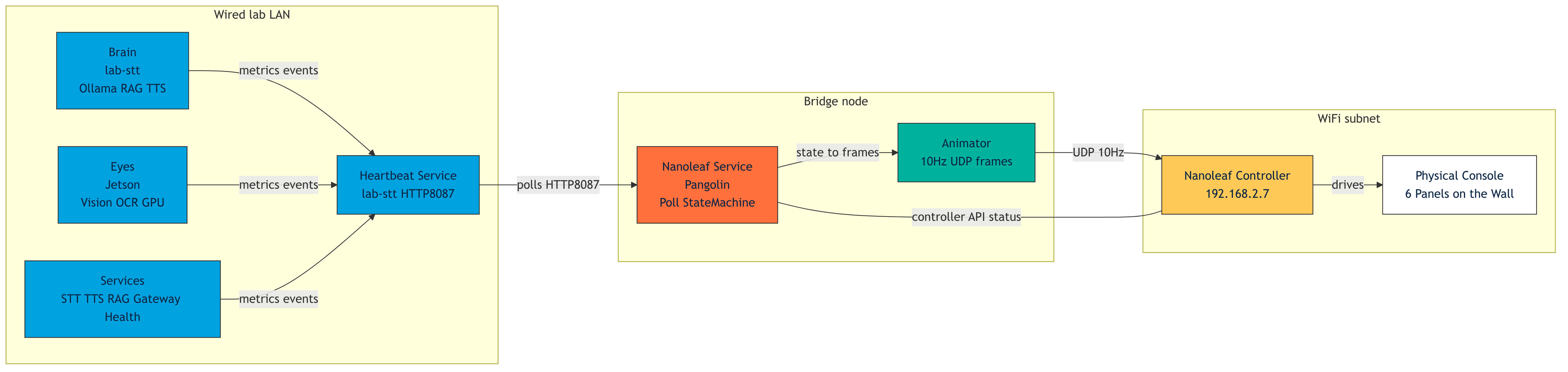
And so, the lab gets a "face": six Nanoleaf panels arranged like a tiny bridge console. The plumbing is deliberately pragmatic. lab-stt exposes a heartbeat and service metrics; Pangolin polls that heartbeat, maps states into a compact state machine, and streams 10 Hz UDP frames to the Nanoleaf controller on the Wi‑Fi subnet. Pangolin exists because it can see both the wired lab LAN and the controller’s Wi‑Fi - home networks are usually budget constrained and the UX should accept that reality rather than paper it over.
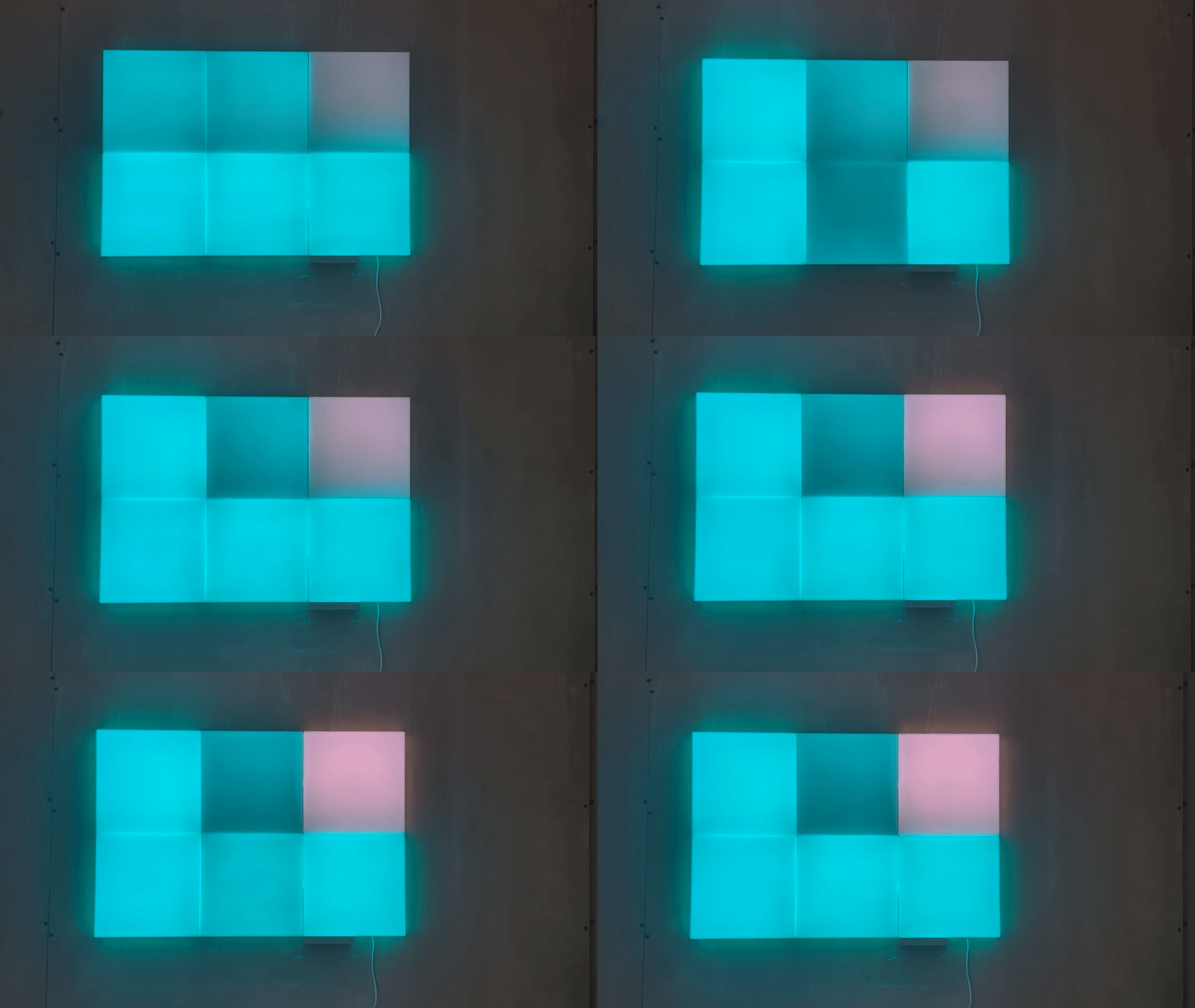
The translation is human‑first. Color, rhythm, and motion become a vocabulary of sorts: a slow white breath for baseline health, a fast violet pulse for inference, amber double‑blink for degradation, hard red strobe for critical failure. Motion is grammar; color is shorthand. Stillness is the anomaly. The goal is not to replace logs or runbooks but to make the system legible from across the room - to teach what normal looks like, to reserve alarm for what matters, and to give the lab a presence that feels less like a black box and more like something you can understand without stopping your life to view logs or runbooks. Systems should always have UX, in my opinion anyway.
Phase 1: The Physical Console
The first move was literal: give the lab a face. Six Nanoleaf Blocks mounted like a tiny Star Trek TOS bridge console become a set of glanceable surfaces - Gateway, Services, Alert, lab‑stt, Pangolin, Jetson - each one a single, simple instrument for a specific class of state.
This is not a dashboard. It is not a replacement for logs or runbooks. It is a room‑scale instrument designed for peripheral awareness: something you notice while getting another coffee, not something that demands you stop and ssh to tail the logs. The service that drives the wall runs on Pangolin because it serves as the control plane now. It can see both the secure and network segmented wired lab LAN and the controller’s Wi‑Fi on the same subnet. That messy, pragmatic detail is the point: home networks aren’t tidy diagrams, and the UX should bring intuitive context to people, not just surface digital noise.
Therefore, the Pangolin polls heartbeat metrics, maps them into a compact state machine, and streams color + motion frames to the controller. The wall becomes a small appliance - not a browser tab, not an alert stream - that communicates posture and intent.
Phase 2: Brain
lab‑stt is the brain stem: inference, retrieval, orchestration, and the plumbing that routes voice → RAG → Phi-4/5 Qwen Variants/Gemma → TTS. The monitor does not translate raw telemetry into panic; it translates telemetry into human meaning.
- Inference → violet pulse: the lab is thinking.
- Idle but healthy → dark blue with a low breath.
- Network I/O → white flicker.
This is a deliberate act of translation: the wall should tell you what matters to a person in the room, not what matters to a pager. The model is a component in a chain; the visualizer is the translator that turns that chain into posture.
Phase 3: Eyes
Jetson is the eyes: OCR, object detection, GPU work. Giving perception its own panel makes machine sight legible from across the room.
- GPU active / vision processing → cyan pulse or focused flicker.
- Camera unreachable → amber warning.
- Critical fault → red strobe.
The eyes panel is a peripheral cue: you should be able to tell whether the perception stack is awake without opening a terminal.
Phase 4: Services
Services are the organs - unglamorous, essential, and mostly noticed when they complain. The Services panel compresses many moving parts into a single mood:
- Healthy → steady dark blue.
- Telemetry active → cyan flicker.
- Degraded → amber double‑blink.
- Critical → hard red strobe.
Design principle: restraint. Normal work should not trigger panic. Good monitoring teaches what normal looks like so alarms remain meaningful.
Phase 5: Tools and Flows
Tools are the lab’s verbs: listen, speak, retrieve, summarize, control. Flows that cross multiple services become choreography on the wall - a ripple, a cascade, a breath - rather than a flood of notifications.
- Voice Q&A → gateway flicker → lab‑stt violet pulse → services settle.
- Home automation → gateway pulse + gold SDR indicator if audio recording is involved.
- Document ingest / RAG → services flicker then white breath on completion.
It's the feeling of the ship as she moves through the waters day to day here.
Phase 6: Color and Motion as Language
Color is shorthand; motion is grammar. A static color is easy to ignore; rhythm becomes a language you learn by living with it.
- Breath - baseline health.
- Flicker - telemetry and I/O.
- Pulse - focused work or inference.
- Strobe - urgent failure.
Keep it simple enough to become familiar, theatrical enough to be readable from across the room, and disciplined enough that each gesture has a clear, consistent meaning.
Phase 7: Stillness Is Suspicious
A deliberate inversion: panels should always animate at a low level. Motion signals life; stillness is the anomaly. If the wall goes quiet, the visualizer itself may be down - and that is worth noticing immediately.
This flips the usual steady‑green expectation and aligns the interface with lived experience: systems that do real work rarely sit perfectly still.
Phase 8: Complement, Not Replacement
Dashboards, logs, runbooks, and alerts remain essential for diagnosis and remediation. The Higher Brain Monitor serves a different job: awareness, not attention. A dashboard answers what exactly is happening; the wall answers is something happening, and does it need me?
The goal is quiet legibility - to teach what normal looks like, to reserve alarm for what matters, and to give the lab a presence that feels less like a black box and more like a system with body language you can understand from across the room.
Why This Feels Personal
I build home systems because I learn by living with them. Right now? I'm on an AI architecture path, and I'm not alone.
Azure cloud is my work, and I love it. But cloud also abstracts away the details: someone else’s machines, boundaries, and failure modes. Those abstractions only become real when they arrive as a ticket, an incident, or a surprise bill.
My home lab is intentionally different. I use the tools I build, daily, and I have the excitement of the guy who uses a block of wood to make something they find beautiful. This is why I am doing all of this work on the weekends. Also, it helps me to connect to my mom in some small metaphysical way… the best part of her is here with me.
Desired Results
Using this pattern, the V1 Higher Brain Monitor delivers:
- Peripheral awareness - understand basic lab state without opening a dashboard.
- Physical observability - important machine activity has a visible presence in the room.
- Human‑scale meaning - CPU, GPU, service health, and reachability translate into signals people actually understand.
- Restraint - not every busy state becomes an alarm.
- Legibility - idle, active, thinking, warning, and broken are visibly distinct.
- Reliability - the monitor behaves like an appliance, not a prototype.
- A little joy - useful systems can also be humane and fun.
Key Takeaway
This is a small, specific project - six panels, a heartbeat, a state machine, and a pragmatic bridge node - but it aims at a larger idea: make local AI feel less like a black box and more like something you can read from across the room. Dashboards and runbooks still matter for diagnosis. The wall answers a different question: is something happening, and does it need me?
Sometimes the right interface is a sentence. Sometimes it’s a button. Sometimes it’s a runbook. Sometimes it’s a voice. Sometimes it’s just light moving across the wall, quietly telling you the machines are working.
Put the idea first; build with curiosity, improvise the means, and let the light on the wall prove that exploration mattered more than the tools.
Personal Dedication
For Joan Breece, thank you for everything I am today.